Page 3 of 25
Re: Nava v1.0 metal Box [WAITING LIST]
Posted: Apr 27th, '16, 07:27
by AonFluX
Looks very good!
Sign me up on the waiting list please.
Re: Nava v1.0 metal Box [WAITING LIST]
Posted: Apr 27th, '16, 08:01
by jonnem
So cool!!!

I signed up on the list!
Re: Nava v1.0 metal Box [WAITING LIST]
Posted: Apr 27th, '16, 09:47
by bmaximus
drumatix wrote:Couple of things... you have "RHYTHM" spelled wrong on the case. You're missing the first 'H'
[resize=800]
http://plus.pointblanklondon.com/wp-con ... TR-909.jpg[/resize]
Second...there's a large gap between the controls and the labels. I think it would look better if "NAVA" and "RHYTHM" were above the controls like the original 909. Maybe that's not easy to do based on the board construction?
Other than that, thanks for the hard work!
Do you mean so...

or so...

however congratulations to Happymum for the great job, I like it!
Re: Nava v1.0 metal Box [WAITING LIST]
Posted: Apr 27th, '16, 10:54
by pr_simon
I think Drumatix meant like this (sorry no proper photoshop on this computer) :
But it looks a bit cramped perhaps.
On the other hand, your photo where they are moved just a little closer to the sequencer looks like a good compromise! (that + reducing space between NAVA letters would probably get it as close to 909ish as can be)
Re: Nava v1.0 metal Box [WAITING LIST]
Posted: Apr 27th, '16, 11:29
by bmaximus
i agree, something like this...

or this...

Re: Nava v1.0 metal Box [WAITING LIST]
Posted: Apr 27th, '16, 11:33
by hofmann25
bmaximus wrote:i agree, something like this...
or this...
The top one is the best. But this thing needs an IEC port.
Re: Nava v1.0 metal Box [WAITING LIST]
Posted: Apr 27th, '16, 13:53
by xone
oooh gimme
Re: Nava v1.0 metal Box [WAITING LIST]
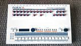
Posted: Apr 27th, '16, 17:58
by wavydave
To me... And with respect to all:
Although having the NAVA logo on the top is keeping in spirit with the original, it looks disproportionate. The massive blank space dictates a need for some artwork - logo or otherwise.
Either way sign me up for two, maybe three.
Re: Nava v1.0 metal Box [WAITING LIST]
Posted: Apr 27th, '16, 18:23
by pr_simon
Most people (well, 3 or 4) agree it seems, that the logo is best placed above the sequencer.
We're omly pointing out details that would make it look even better, but in the end it's up to the original designer to take it into account if he hasn't placed the global order yet !
The IEC issue is well worth considering as well I'm sure.
Re: Nava v1.0 metal Box [WAITING LIST]
Posted: Apr 27th, '16, 19:27
by wavydave
pr_simon wrote:
The IEC issue is well worth considering as well I'm sure.
Oh, definitely on the IEC port. I recommend this style:
http://www.mouser.com/Search/ProductDet ... -6200.2100
